Uncategorized
Decorating “Outside Of The Box” – Free Formed vs. Framed
2 Interior Design Factors That Make Free Formed Wall Hung Sculptures A Welcomed Break From The Right Angled Framed Norm.
I’ve read that the definition of art is “the communication of emotion from one person to another through various creative forms of expression.” Most customers and collectors tell me that when they see my coastal sculptures on their walls, they daydream of simpler times which I’d imagine are associated with vacations spent by the ocean. I’ll confess this was never my intention, but I’m thrilled with the results. If someone’s blood pressure drops a bit because they gaze upon my coastal sculptures, my expectations for what I’ve created have been far exceeded.

With that said, most people, and even many interior designers, seem to be completely stuck “inside the box” in regards to how to decorate walls. Of course, “inside the box” is my tongue and cheek reference to the traditional framed paintings or photographs that fill probably 80-90% of the the walls of homes spanning the globe.
Don’t get me wrong, I’m a huge fan of the traditional square and rectangular framed paintings, but I also see the huge opportunity to make a statement by decorating “outside of the box”. That’s what decorating with free formed wall decor alternatives offer – a break from the norm. Every time I’m at someone’s home who has decorated with any wall hung sculpture, my eyes naturally gravitate to the “outside of the box” option. After years of conversations with hundreds of customers, I’ve learned I’m not the only one whose eyes gravitate towards the framed alternative.

Have you ever stopped to wonder why certain art, especially free formed sculptures, seems to easily catch your eye? I’ve identified two KEY factors below that heavily influence one’s desire to give that second look to the free formed wall sculptures over the framed option.
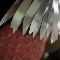
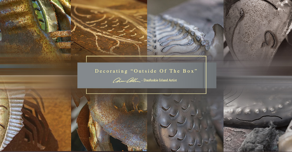
1. The texture differences – My sculptures have hundreds of hammer marks and are not flat like a painting, so they always catch the light differently – a recipe for catching one’s eye.
2. The depth of field differences – The standard depths of a traditional framed painting are 1-1.5 inches. My sculptures vary from 1.5 – 4 inches deep (distance from wall). Similar to the variations in texture, depth of field variations are a great way to “stand out” (pun intended).
 How many times have you walked past peoples’ framed artwork without a second glance? If the colors and lighting don’t immediately catch your eye, it’s easy to never give the painting a second look. The break in the 90 degree edges of a framed piece almost always grab a person’s attention. The next time you go to someone’s home, count the ratio of framed vs. free formed wall decor, and you will start to notice the “eye catching opportunity” I am speaking of.
If you have not already tried the outside of the box idea I’ve just discussed, I dare you to try. I challenge you to be creative when decorating and to think outside of the box. I guarantee you’ll be blown away by how many more remarks you get on your wall hung sculptures than you get to the framed pieces! Let’s face it, you’re not decorating so people don’t notice right? I welcome your comments and experiences.
Chase Allen
October 9, 2019


